Design for accessibility
The Canvas Baseline Practices (CBP) builds on the University’s 2016 ‘Canvas Minimum Presence’ document and forms part of the Curriculum Framework Transformation, supporting the University’s aspirations for developing inclusive and accessible digital environments.
Identifying and fixing accessibility issues within Canvas courses, using UDOIT Advantage, is a key component of Canvas Baseline Practices. From the UDOIT scan results of 2000+ Canvas courses, we now have a clear picture of accessibility trends across the University. The top five issues are explored.
students - or 10% of the total student population in 2024 - identified themselves as having a disability.
Top 5 accessibility issues

1. Headings

2. Links

3. Colour

4. Alt text

5. Tables
Extra tips and specific documents

More accessibility tips & tricks

Accessibility in Adobe Acrobat

Accessibility in Microsoft 365
How do I check for accessibility?
Canvas
Word and PowerPoint
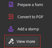
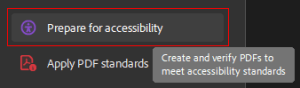
Adobe Acrobat
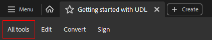
You may need to click View more to show all the tools.
Find and select Prepare for accessibility.
Need help?
It’s essential to create an inclusive learning environment that accommodates students with disabilities. When encountering accessibility issues related to TALIS readings, consider the following resources:
- Faculty Access Portal: The Faculty Access Portal is part of the University’s disability case management system, Symplicity Access. The purpose of the Faculty Access Portal is to allow faculty members to securely view student’s learning and teaching adjustments.
- Ratonga Hauātanga Tauira | Student Disability Services (SDS): Reach out to Student Disability Services for personalised assistance and guidance. They can provide strategies, accommodations, and resources to support diverse student needs.
- Te Tumu Herenga | Libraries and Learning Services: If you encounter any accessibility challenges with TALIS readings, the library staff can assist, you can contact them at readinglists@auckland.ac.nz. They are committed to ensuring equitable access for all students and can provide support related to accessible materials.
For additional help or questions, you can contact the Ranga Auaha Ako, Learning and Teaching Design Team.
See also
Inclusive Design for Online Accessibility (PDF)
UDOIT accessibility assistant for Canvas
Page updated 22/05/2025 (minor edit)