Accessibility practices and tools: Colour and contrast
Make sure your text stands out clearly.
Good colour contrast helps everyone read your content—especially students with low vision, colour blindness, or who are reading on a mobile device in bright light. It’s one of the most common accessibility issues, and one of the easiest to fix.
Why it matters
- Around 1 in 12 people experience some form of colour vision deficiency.
- Poor contrast makes content harder to read for everyone, not just disabled users.
- It affects clarity on mobile devices, especially in bright or low-light conditions.
- Web Content Accessibility Standards (WCAG) requires a contrast ratio of at least 4.5:1 for body text.
What to do
DO
- Use dark text on a light background—or vice versa. The higher the contrast, the easier it is to read.
- Use additional visual cues in combination with colour, e.g., “The red striped sector shows …”.
EXAMPLE:


AVOID
- Light text on pastel shades
- Text over images or gradient backgrounds
- Using colour alone to convey meaning, e.g., “The red sector shows …”.
EXAMPLE:


Getting it right
In Canvas
- Use the Accessibility Checker to test contrast on pages.
- Use clear colour choices for buttons, icons, and emphasis.

Refrain from setting the colour of text manually. It will often become unreadable if students view the course using ‘dark mode’ on the Canvas app. If in doubt, test it for yourself on the Canvas Teacher app.
In UDOIT Advantage
When emphasising text, you may use colour (with sufficient contrast). However, you should also apply some other form of emphasis, such as bold or italics.
UDOIT issue identified: “Avoid using colour alone for emphasis”
- Click the Review button for more information.
- Check the boxes for the change(s) to resolve this issue and click ‘Save’.
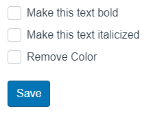
You do it options for text are: Make this text bold, Make this text italicised, and Remove colour.
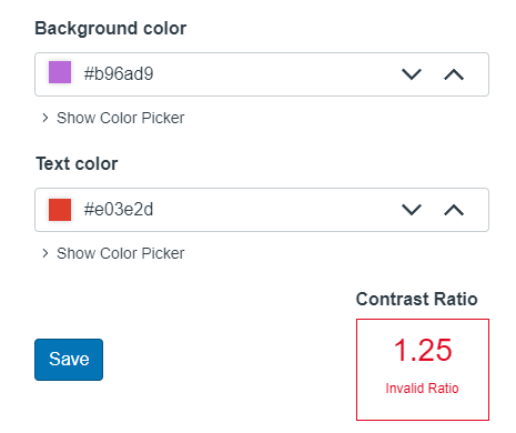
UDOIT issue identified: “Insufficient text colour contrast with the background”
- Click the Review button for more information.
- Change the colour of the text and/or the background until the contrast ratio indicator shows a valid ratio.
In Microsoft Word
- Use built-in theme colours—these usually meet contrast standards.
- Avoid manually choosing pastel or similar-toned text and background combinations.
- Check colour contrast with the Microsoft Accessibility Checker.
Related Canvas Baseline Practices and Universal Design for Learning
- Canvas Baseline Practices require sufficient colour contrast across all Canvas pages.
- Universal Design for Learning encourages presenting information in formats that all learners can perceive and understand—regardless of visual ability.
Tools and checks
- UDOIT (Canvas) – highlights colour and contrast issues and allows you to fix them in situ.
- Microsoft Accessibility Checker – will flag colour problems in documents and slides.
- Adobe’s Prepare for accessibility feature – alerts you to colour and contrast issues in PDFs.
- WebAIM Contrast Checker – is a simple colour pair checker with WCAG compliance feedback.
- Coolors Contrast Tool – allows you to test colours and generate accessible palettes.
- Tanaguru Contrast Finder – helps find compliant alternatives to failing colour pairs.
Page updated 27/11/2025 (minor edit)